Creative chemistry for creative minds
With a history spanning 80 years, Haviland Enterprises is a world-leader in cleaning, plating, and anodizing chemistry as well as a leading producer of pool and spa treatment products. Dive a little deeper and you’ll find a team of employee owners driven by strong values and a culture of creativity.
We first met Haviland in 2008 when we helped a friend of a friend with a small web project. It was a thrill when they reached out directly 13 years later to talk about the next, next generation of their website.

Outgrown & Overgrown
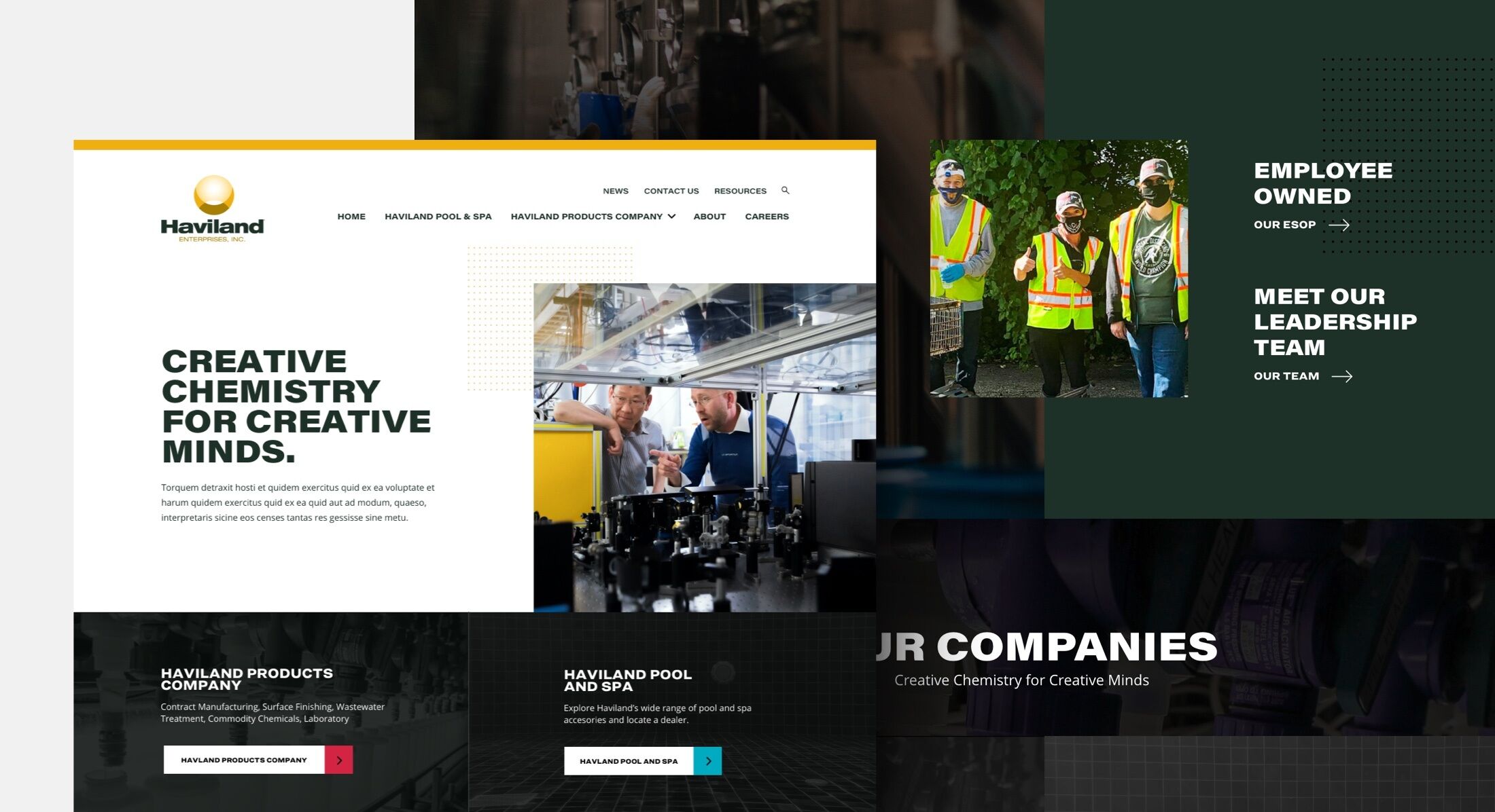
Haviland is an industry leader. But their website wasn’t representing them well. They’d outgrown the structure, hampered by cobbled-together pages and excess content that nobody needed. Each of their seven product lines had its own website without any clear connection to the main site. And with a renewed focus on marketing, they needed a way to launch compelling landing pages quickly—something their current site didn’t support. To bring it all together, they needed a comprehensive refresh to their digital branding to set the tone for new marketing material.
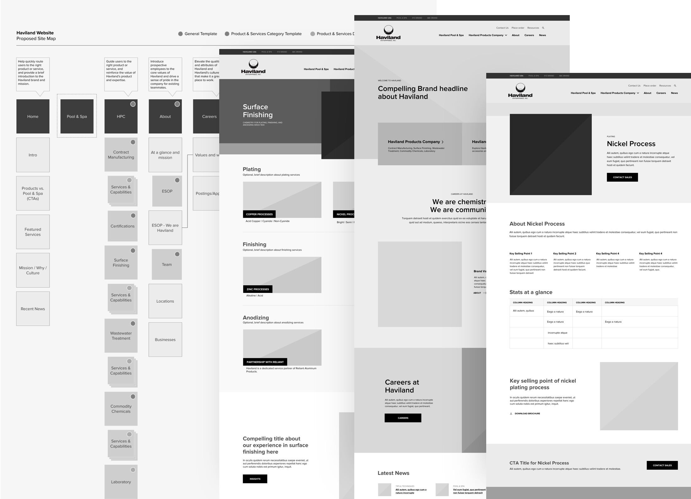
Working with Haviland is energizing. They move quickly, come to the table with ideas, and trust us to set the direction. With their goals as the guide, we started with their site map and collaborated to rebuild the information architecture. This revealed an important discovery. Haviland’s customers know them as two distinct companies: Haviland Pool and Spa, and Haviland Product Company. The website needed to unite these two identities under the Haviland Enterprise brand, and provide clear product and service offerings within these sections.
One Company, Three Brands
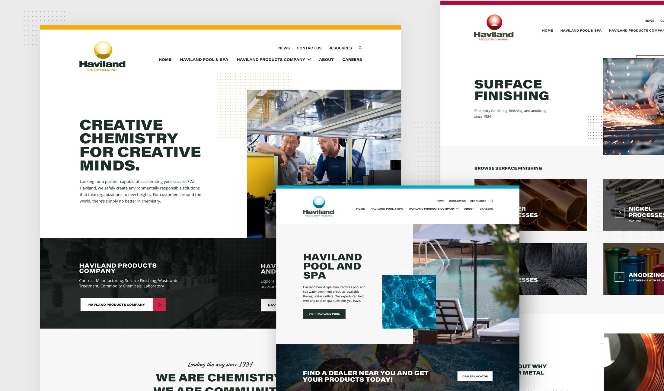
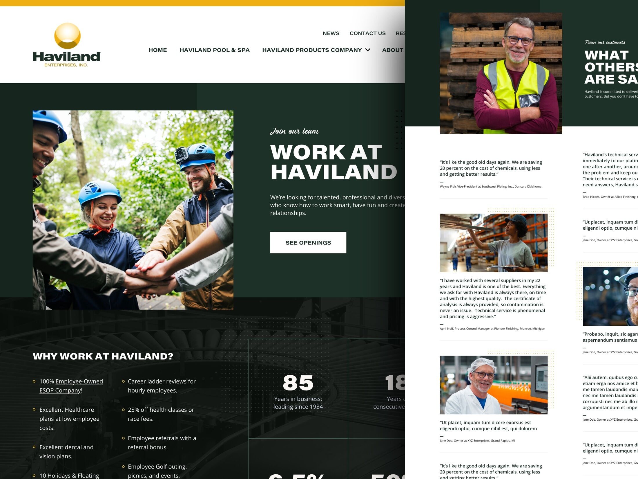
Haviland needed to display one of the three sub-brand logos and color palettes for each of the three main sections of the site. Establishing a way to support these branded sections rose to the top of our design and development challenges. We put together a system that would support these brand changes in a way that wasn’t confusing for users, and not visually overwhelming for a single website.
Getting Resourceful
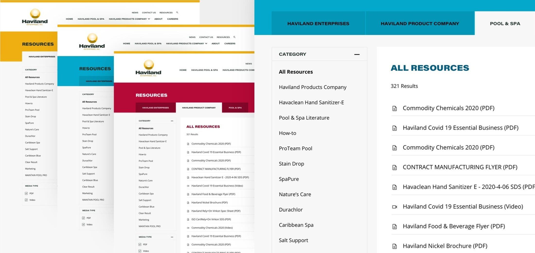
One of the most frequently visited areas of the Haviland site is the Help section and its resources. This content needed organization by sub-brand with better clarity about the types of assets that were available. Homeowners looking for videos tips for managing their pools and store managers seeking marketing material both need to find what they’re looking for. We wanted to serve them both well without requiring them to tell us who they are. We developed an elegant way to manage these resources in a single place in the CMS, while presenting them to the user according to the company brand they’re most familiar with.
Blocking It In
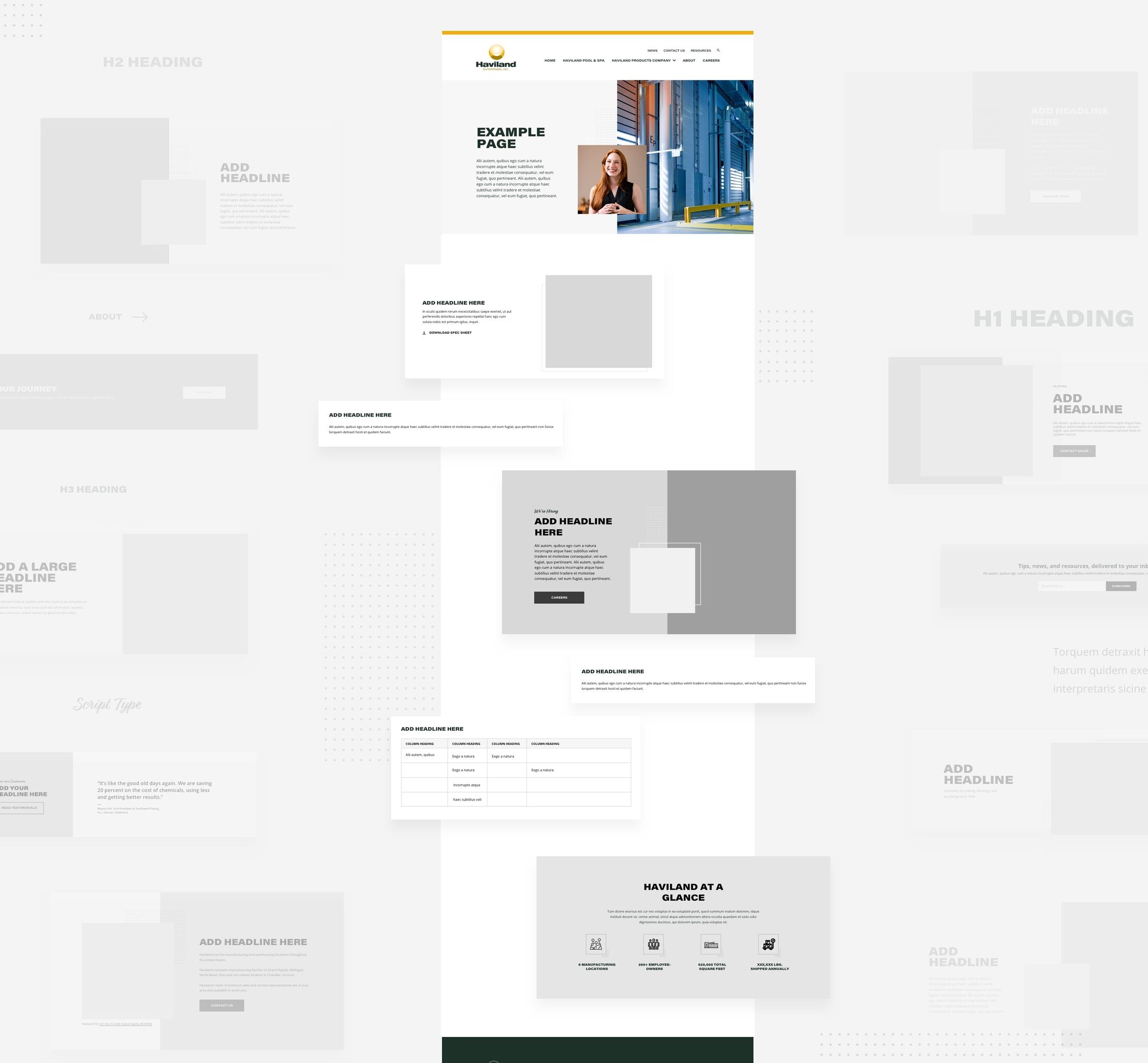
Haviland’s product and service offerings vary extensively. Some pages require tables of technical details, and others need photography and very limited copy. Campaign pages also need to feature heavy campaign branding and calls to action. To meet these needs, we equipped Haviland with a flexible page builder and a library of modular content blocks. It’s not a one-size-fits-all system. Each block is designed to support their content goals, and smart enough to look cohesive in varied real-world combinations.
Until Next Time
We were proud to pick back up with Haviland and help them successfully launch a powerful new 3-brands-in-1 website. With a new content structure, clearer brand relationships, and creative tools for their marketing team, they’re well positioned to continue to lead. We can’t wait to work with them again.
Have a project? An idea?
Our favorite clients tend to treat us as part of their team (and vice versa). If you’re looking to make something digital and interesting, we’d love to help you bring your ideas to life.
Get in touch

