Launching and growing an academic publishing brand
Ever since 1988, Zondervan has been HarperCollins’ principal Christian book publishing division. Zondervan is continuously growing, expanding, and impacting the world. One of those expansions was the addition of Zondervan Academic (ZA). Zondervan understood they had a large following of Christian scholars, and wanted to equip them with the best resources for research, teaching, preaching, and lifelong learning.
This was their expertise... website design and development however, was not. They reached out to Mighty for the first time in 2013 to create zondervanacademic.com.

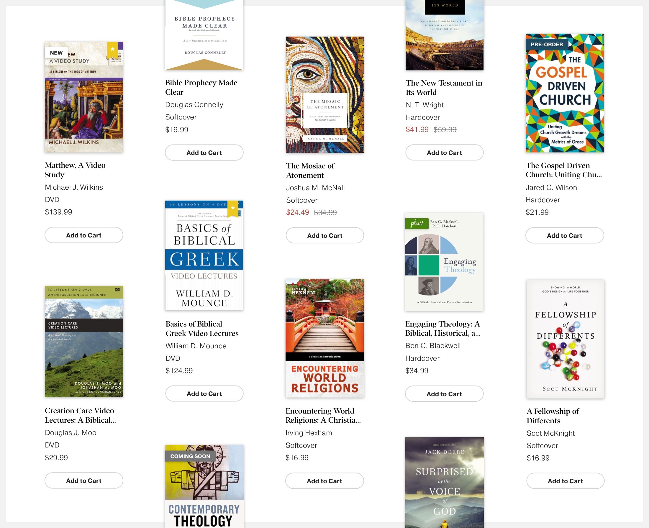
Where it all started
The academic group at Zondervan had been operating a small web app called TextbookPlus for a few years, which offered free teaching and study resources for instructors and students that enhanced popular Zondervan textbooks. They also had a blog called Koinonia that had amassed a considerable following. They wanted to unite these digital properties under the banner of Zondervan Academic and establish Zondervan Academic as the #1 publisher for evangelical Christian academics and the most trusted resource for instructors. With that goal in mind, they reached out to Mighty to design and develop a website and community of resources for their academic audience.
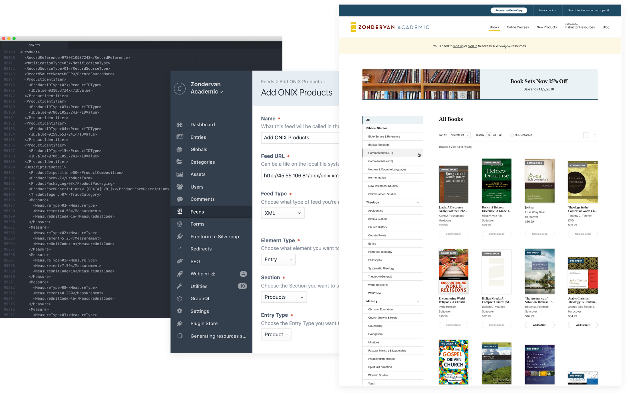
In 2013, we worked closely with their team to consider TextbookPlus and the old Koinonia blog and develop the information architecture, experience design, CMS, content and user migration plans, and technology integrations—including with Onix to pull in product data for every single academic title in Zondervan's vast catalog—to establish a new zondervanacademic.com experience. In 2014, we launched Zondervan Academic's first, official website.
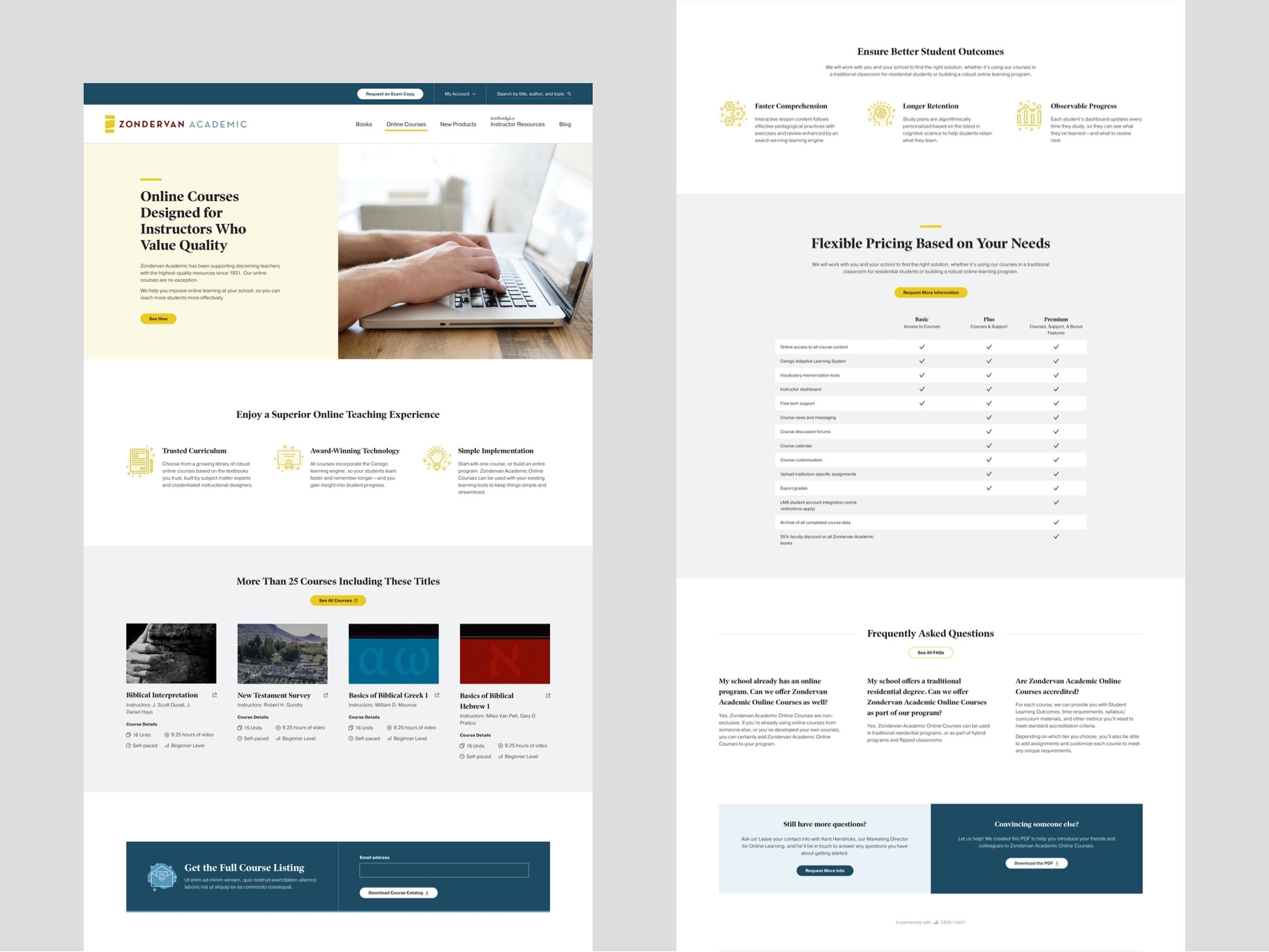
Over the next 6 years the Zondervan Academic brand and their website's impact and influence continued to grow. We enhanced the site with advanced analytics, added features like promotional landing pages, and optimized it for performance and conversions. Notably, in 2015, we worked with BibleMesh to develop the strategy, design, and development integrations to go to market with Zondervan Academic's online courses platform.
Working together for all these years, Mighty developed excellent rapport with the Zondervan Academic team. We'd also gained considerable institutional knowledge, and knew their business, audiences, goals, strategies, content, and technology very well. We continued to learn more each year.
A brand new challenge
While the site was thriving by many measures, it was also beginning to show its age. We'd maintained and updated it over the years, but much of the underlying technology was approaching "end of life." Because we had a relationship to proactively steward the site, we brought this need to the Zondervan Academic team's attention well in advance, and began to plan a major update for 2019.
We knew we wanted to upgrade their core CMS technology, originally built using Expression Engine, to the latest version of Craft CMS. But the required changes presented other opportunities as well—to reevaluate priorities and optimize the experience. Also, Zondervan had been toying with the idea of on-site ecommerce and was considering a move to Shopify.
After years of strategic support, incremental enhancements, and user growth, we planned and executed a major update in 2019 with five key goals: modernize the user experience, increase exam copy requests, optimize lead generation efforts, begin selling direct to consumer, and maintain the SEO rankings we'd already achieved.
"Mighty challenges us. They ask questions and we talk about our goals. They learn the 'why' before recommending the 'what' and deciding on the 'how.' If you want a great partner, start a conversation with Mighty."
—Adam Forrest, Zondervan AcademicModernizing the user experience
Fortunately, the extensive information architecture and content strategy work we'd done for the initial site build paid off here. While the technology would need to change, the underlying content structures and navigation patterns could stay the same, even after all the time that had passed.
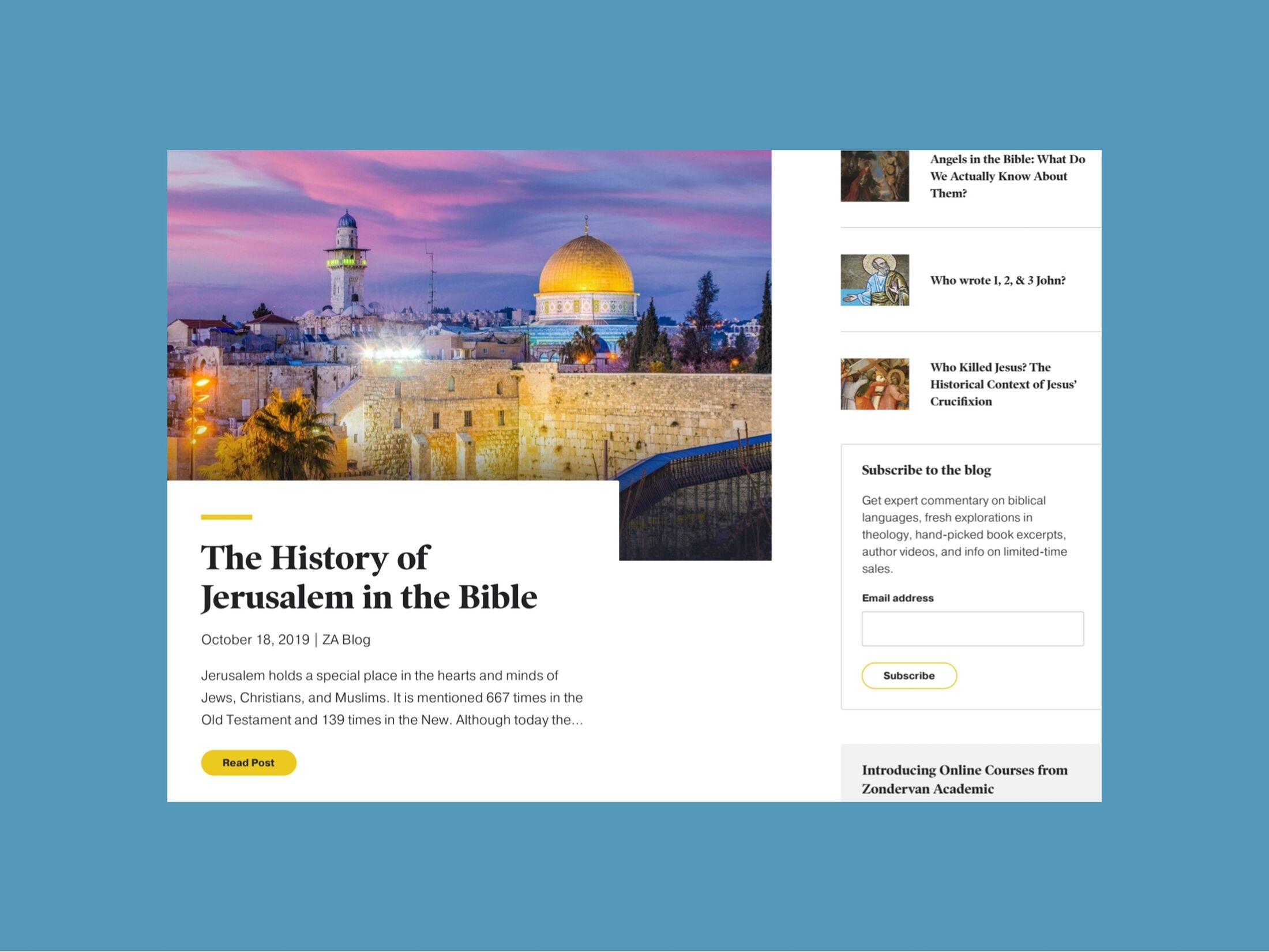
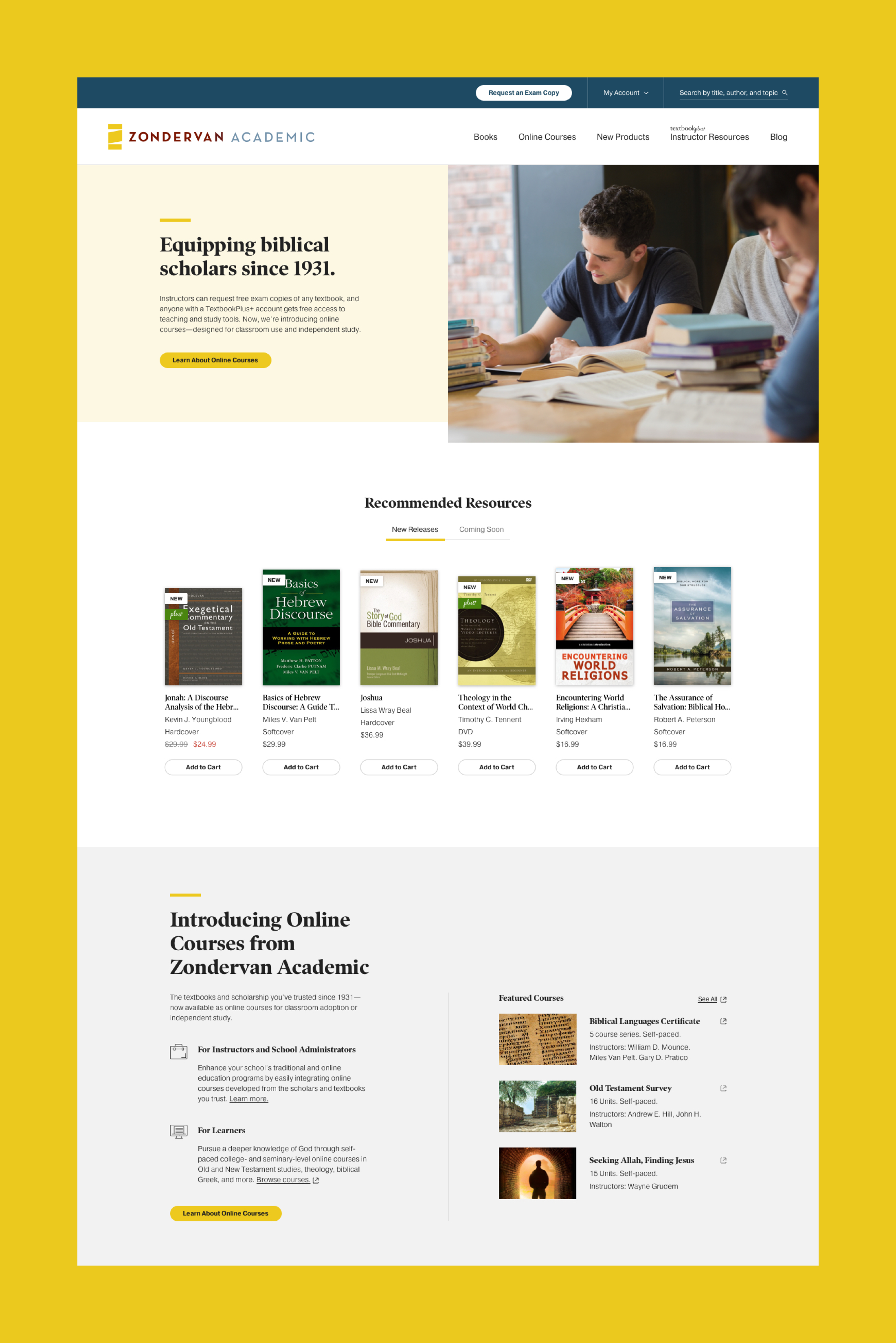
Still, we wanted to strengthen Zondervan Academic branding through a fresh visual design. And, although we were giving the site a facelift, we had to make sure it still felt familiar to the user. Also, we wanted to make sure enhancements to the appearance and interactions of the site supported marketing goals.
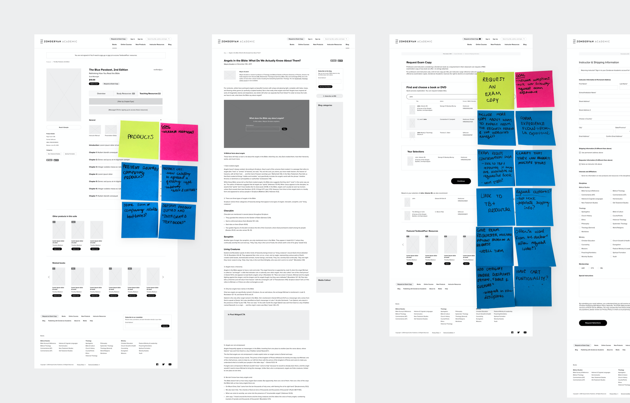
We started the process by creating a moodboard, revisiting wireframes, and designing style guides for a new design system.
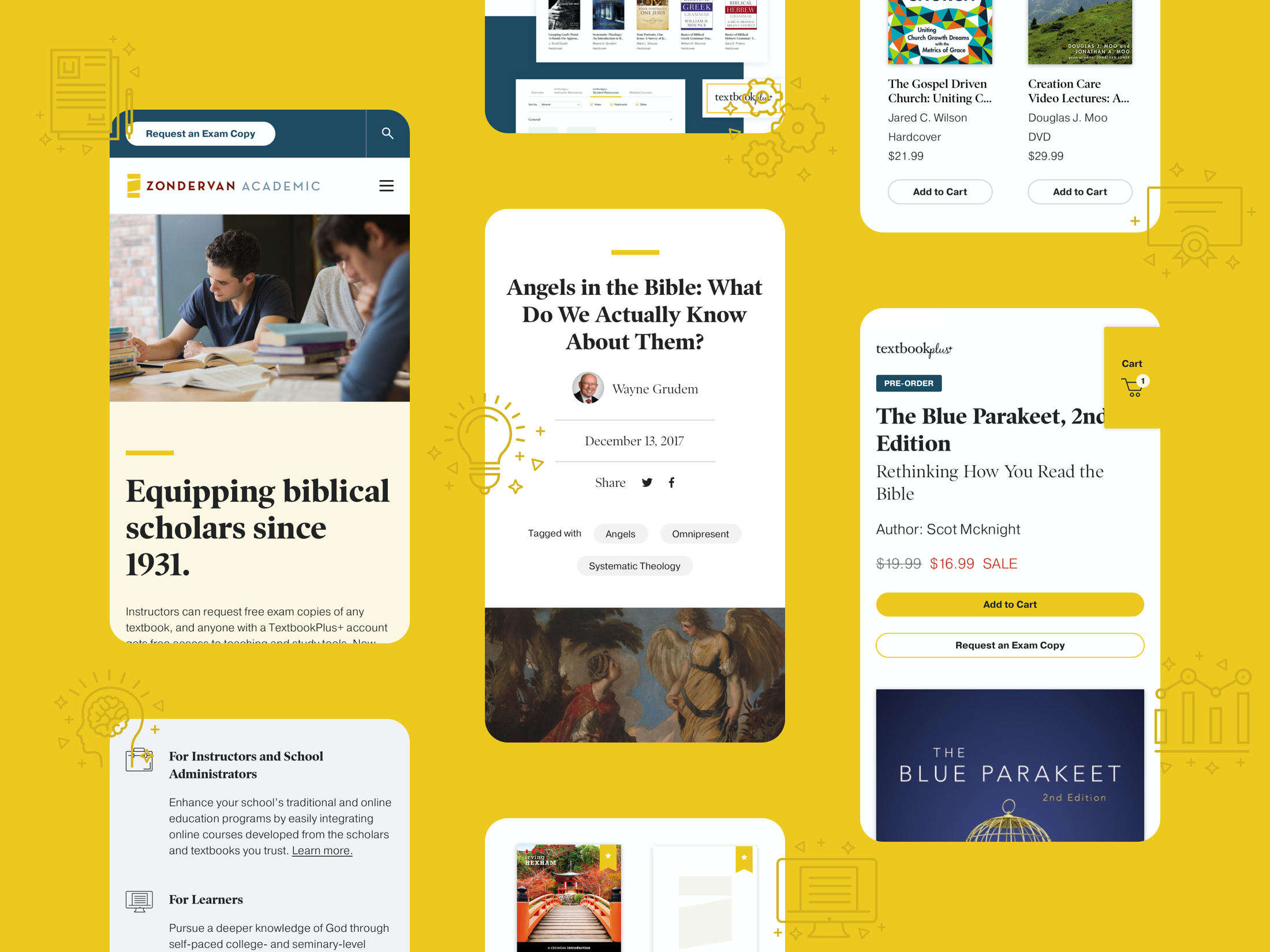
As always, we considered both the mobile and desktop experience, and chose fonts and colors in keeping with web accessibility best practices.
Increasing exam copy requests
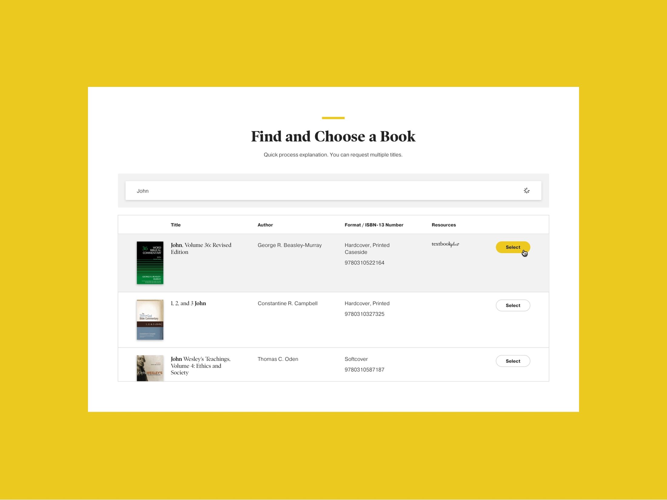
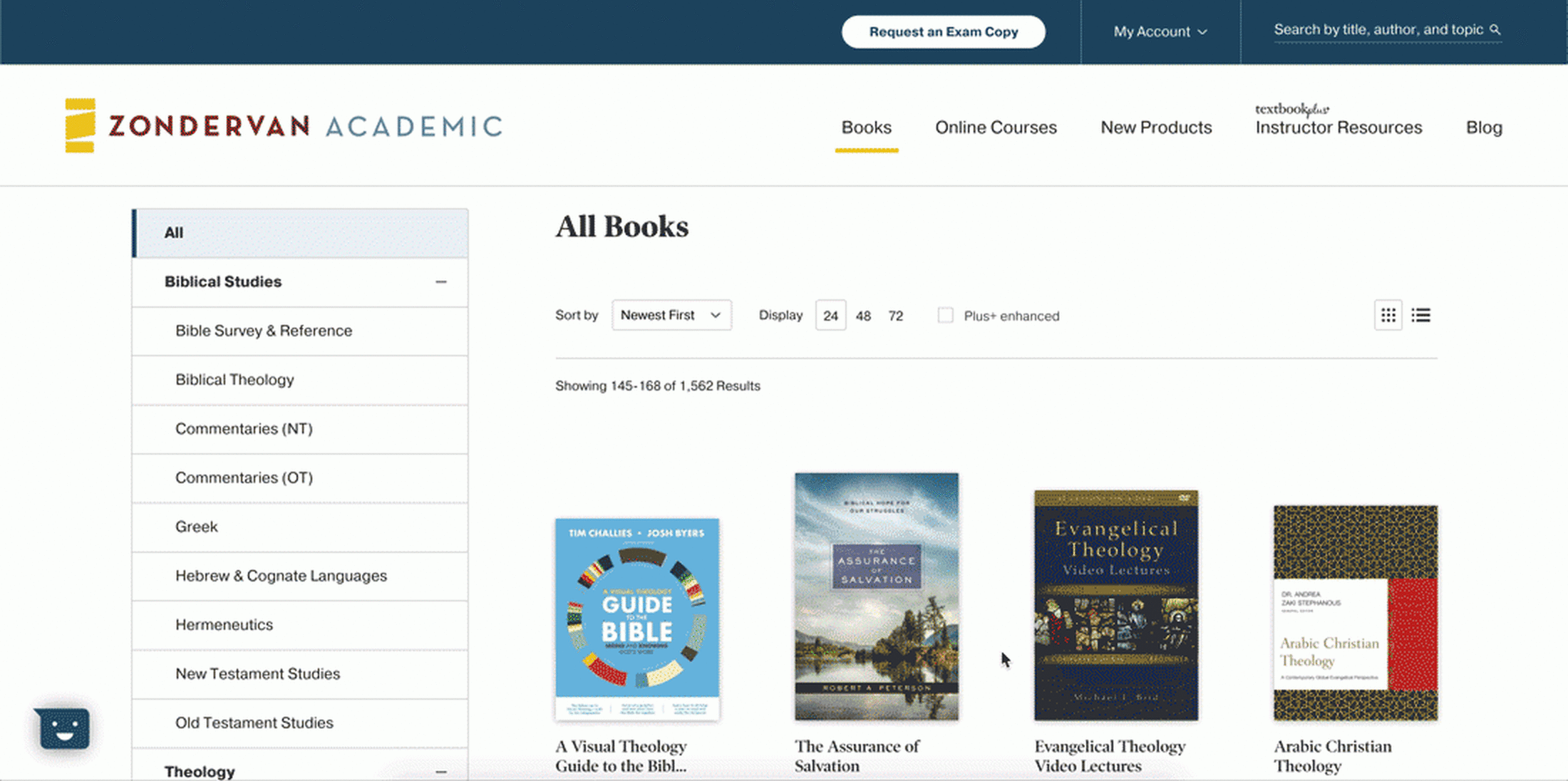
One of the most critical new features of the original zondervanacademic.com had been the "Request an Exam Copy" form. Zondervan offers verified higher education instructors the ability to request a free examination copy of any book—no strings attached. Giving away these textbooks to interested instructors is actually a massive revenue driver for the company; each request is valued at more than $100, given the likelihood that it will lead to that textbook being adopted for use in the classroom.
We'd already done considerable optimization work over the years, and had identified opportunities to improve it even further. Our redesign—which made the feature more prominent and even easier to use—led to a 40.13% year-over-year conversion rate increase and 14.89% more request completions.
Optimizing lead generation efforts
Zondervan Academic provides a lot of content—and does a lot of their marketing—through email. Their website is the major source of new email newsletter subscriptions. One of the goals of the redesign was to improve these lead generation efforts. We updated the appearance and placement of the various signup forms throughout the site, incorporated more targeted questions into the signup form to solicit information about a subscriber's specific interests, and wrote a custom Craft plugin to integrate submission data with Sailthru, Zondervan Academic's email marketing and marketing automation tool of choice. In the year following the redesign, the email signup conversion rate leapt 57.60% leading to 29.21% more newsletter subscriptions.
Selling direct to consumer
Prior to the redesign, product detail pages on zondervanacademic.com had a "Buy Now" button … but it was merely a link offsite to a different HarperCollins property. As ecommerce experiences go, it was pretty high-friction, and the site wasn't a major driver of transactional revenue.
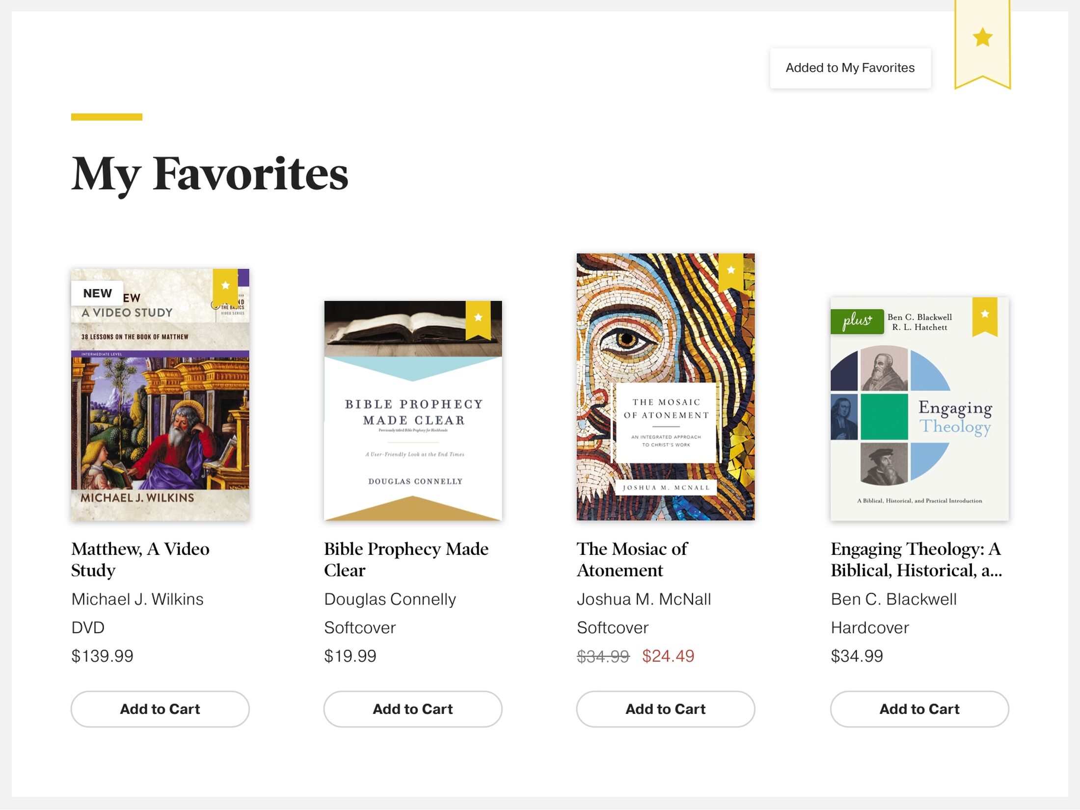
Meanwhile, HarperCollins had recently moved the entire Zondervan product catalog to the updated ChurchSource Shopify site. We saw an opportunity. By merging the existing feed of product data from Onix with the products' corresponding ChurchSource Shopify IDs, Mighty was able to integrate Shopify ecommerce directly into the UI of zondervanacademic.com. This let us pull in accurate product pricing data and add a Shopify "Buy" button to all products. We also dynamically updated the button text and styling based on product availability. Now users can browse and shop the entire Zondervan Academic catalog, add products to their cart, and checkout without leaving zondervanacademic.com. More than 16,000 users used Zondervan Academic to shop in the first year after launch.
Maintaining SEO rankings
Since the original migration from TextbookPlus and the old Koinonia blog to zondervanacademic.com in 2013, Zondervan Academic's reputation and rankings had grown exponentially. Back when we first started measuring, less than a quarter of their traffic came from organic search and their blog attracted just over a thousand sessions a month. Five years later, nearly 80% of ZA's traffic came from organic search and the blog often attracted more than 80,000 sessions a month. We didn't want to lose those gains.
Again, our solid information architecture from the original build meant that we could preserve most of the existing link structure. Because we were completely changing the underlying technology platforms, though, we had to do a lot more than simply recreate and refresh the front-end styles for all the existing content—we needed to migrate more than 2,500 blog posts, 1,000 teaching and study resources, and thousands of products from Expression Engine and Wordpress to Craft CMS, all while preserving content structure and internal links. We were meticulous in planning content migrations and redirects. Following an expected dip immediately after launch, rankings recovered to 2018 levels by the end of the year.
Delivering what we promise
As a company, we aren’t afraid to be honest and vocal when we run across problems or issues. In fact, we're committed to that kind of honesty and transparency with our clients, particularly when it comes to project status and budget. We've been doing this long enough that we know to anticipate that unexpected complications inevitably arise when you're trying to solve complex problems in an ever-changing industry.
So, here's the honest truth—this project took a lot more work than we anticipated. The quantity and complexity of all the small details required to execute all of this quickly added up, and we realized we'd need to push back the launch date. We collaborated openly with the Zondervan team and agreed upon a time extension to ensure that we could release work that met all of the goals. And then we did it.
Have an idea? A project?
Our favorite clients tend to treat us as part of their team (and vice versa). If you’re looking to make something digital and interesting, we’d love to help you bring your ideas to life.
Let's talk
