Not your typical concert venue
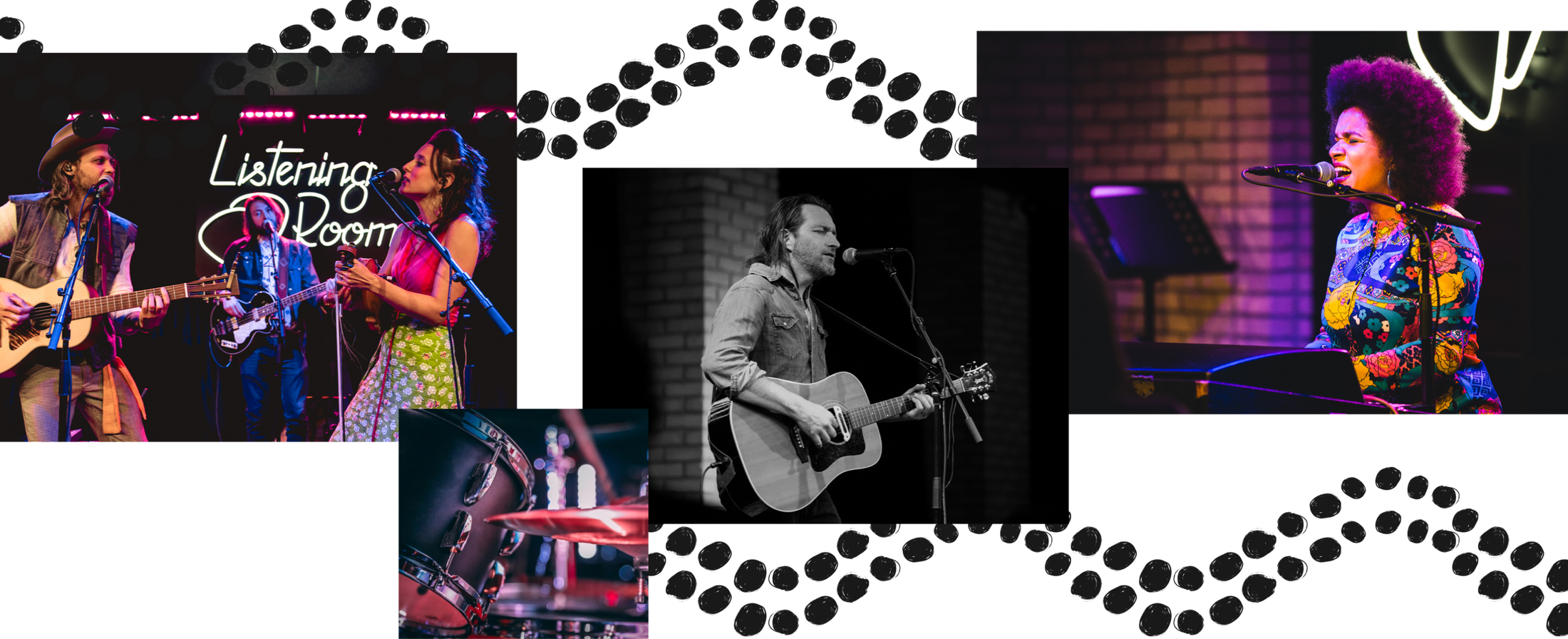
Part of Studio C’s downtown entertainment venue, The Listening Room is an exceptional music venue for discerning concert-goers. With a world-class sound system and a semi-circle of only 200 seats, it’s a place for more engaged musicians and a more captive audience. And Studio C is no stranger to captivating audiences. As the parent company to Celebration Cinema, the region’s largest collection of theaters, Studio C brings concertgoers “so close you can read the setlist” in an unrivaled atmosphere.

Research: The Foundations for a Bold new Place
The team at Studio C dreamed up an amazing vision for an intimate, dynamic music venue at the heart of an interconnected, multi-venue facility. It’s one thing to dream it, and another to realize it from the ground up—literally. When Studio C came to us with their idea, The Listening Room was a gravel pit and a lot of imagination.
With so much riding on the success of the new venue, and with an idea unlike any other in the region, we had an opportunity to partner with The Understanding Group to conduct a thorough research phase. Interviewing concert-goers helped surface some important discoveries. Among TUG’s findings, we learned:
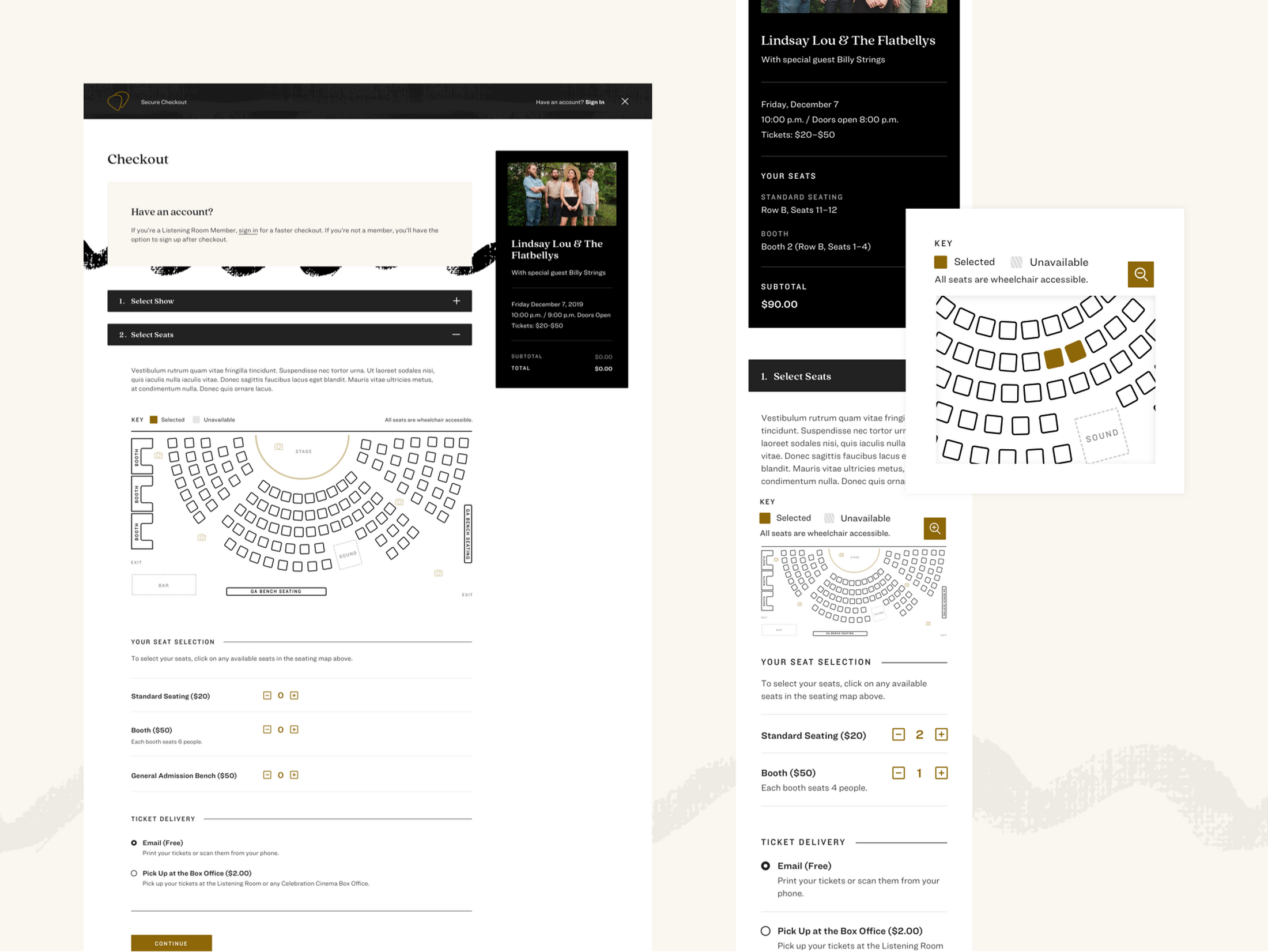
The mobile experience is paramount. People buy tickets online, but also expect to be able to plan and share information with friends, coordinate schedules, and access and scan tickets without leaving their mobile device.
Low ticket indication is an important factor for deciding whether to purchase tickets or wait.
Concertgoers fit their plans to the show (vs. moviegoers, who tend to fit the show around other plans).
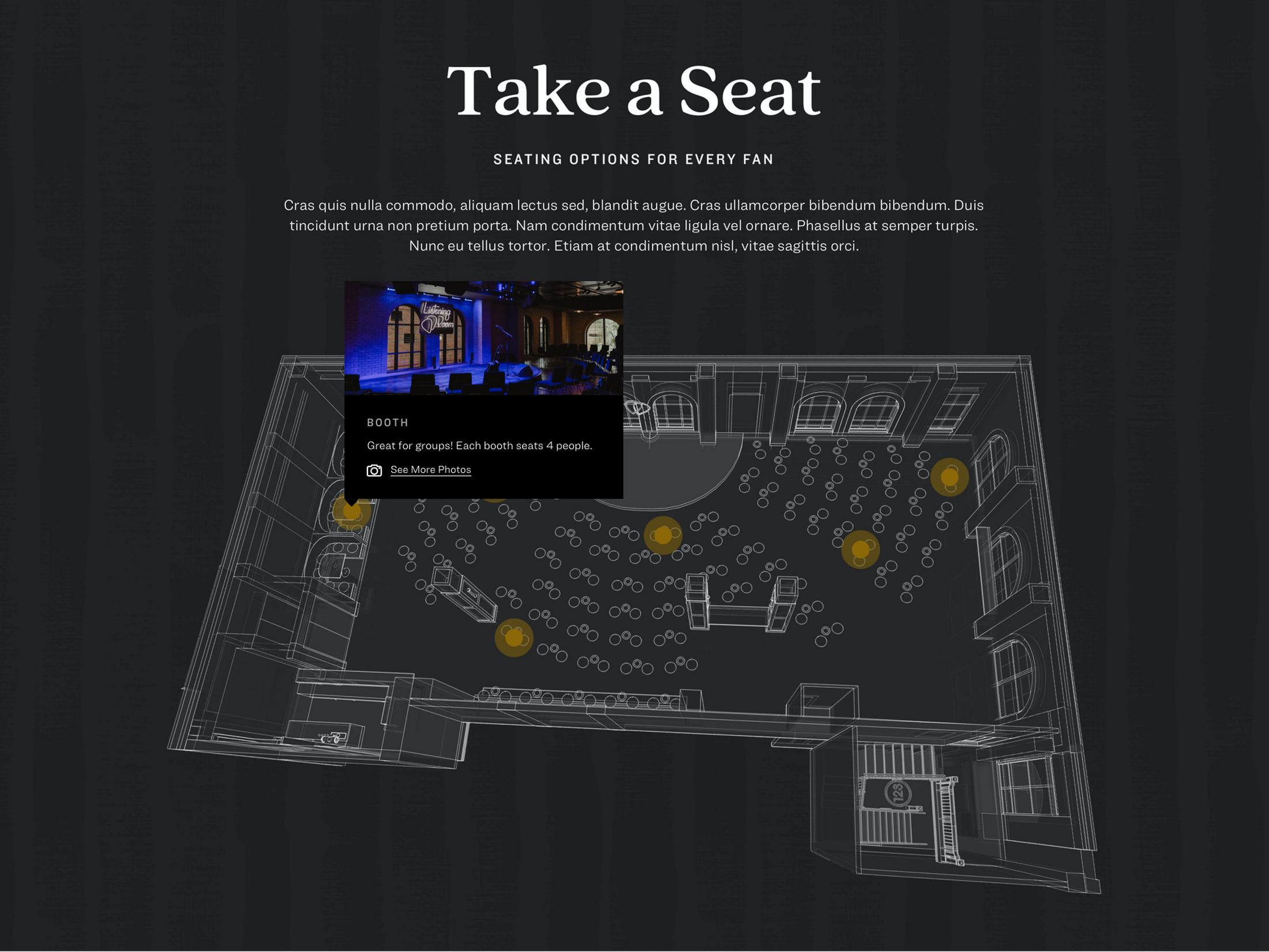
Concertgoers have unique needs for being able to picture the concert experience. Seeing the space, visualizing the view through a crowd to the artist, and imagining the acoustics is important.
With user interviews complete, research summarized, and a structural model in place from TUG, we were ready for wireframing.
Visual Design
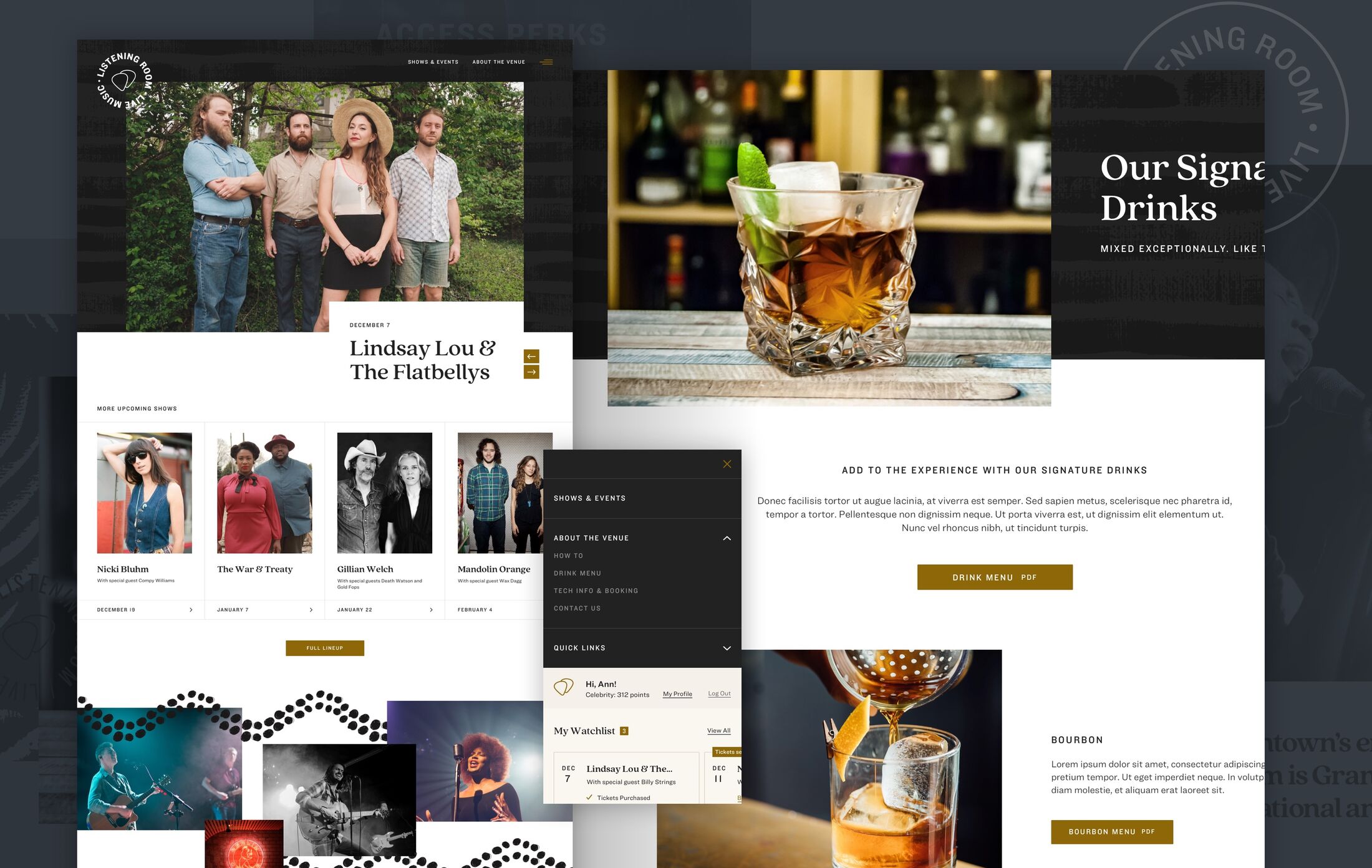
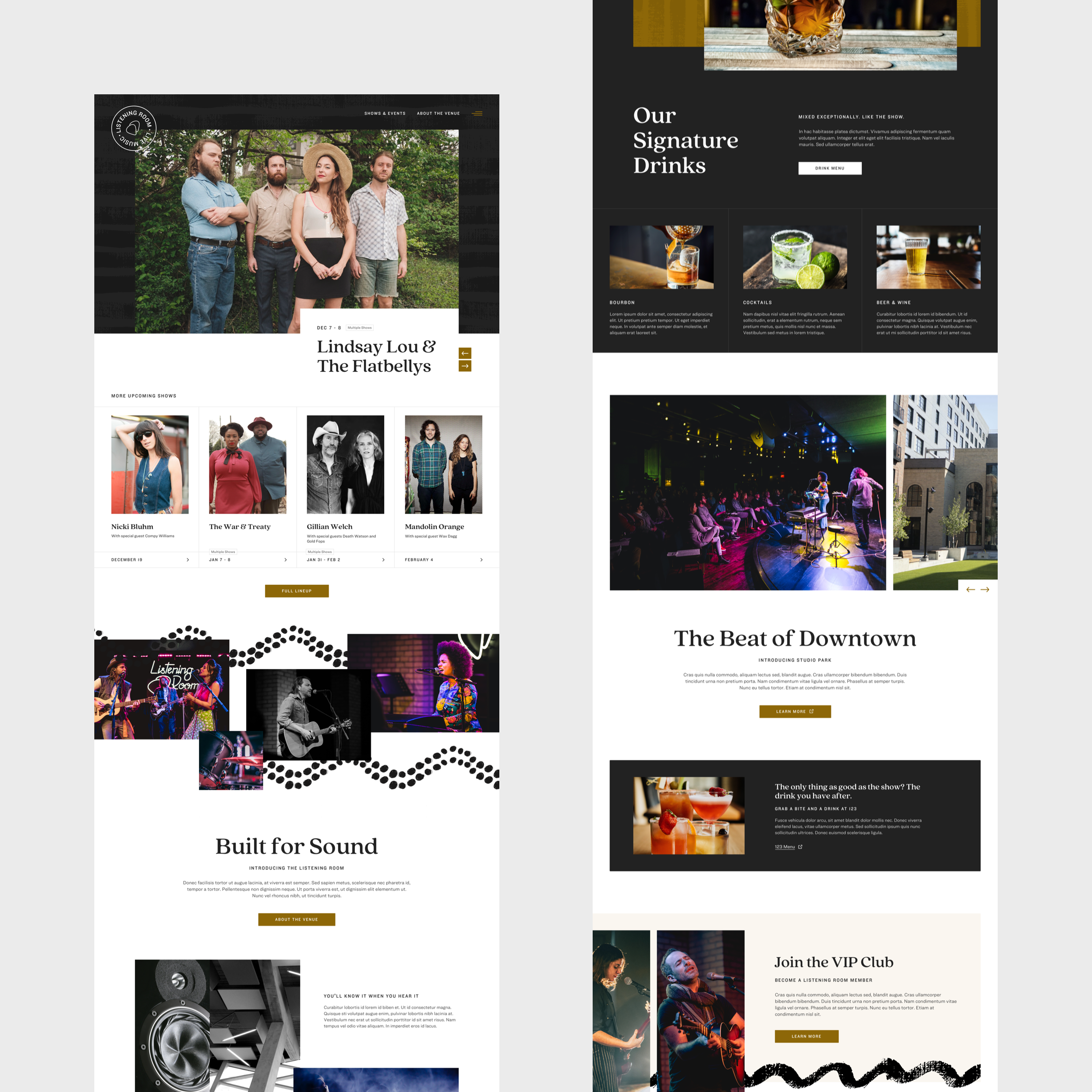
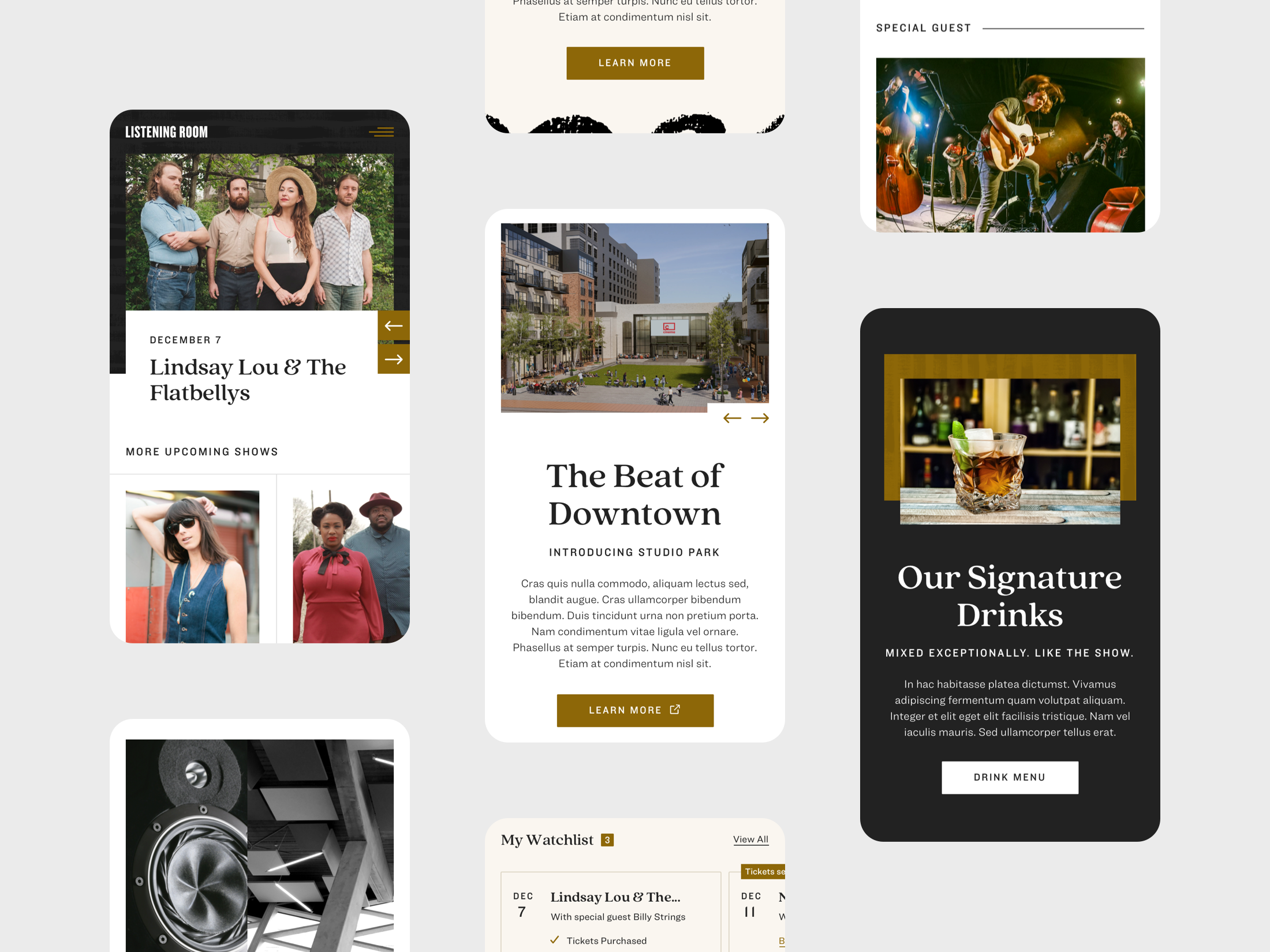
Studio C came to Mighty with a vision for a place and the need for a website, but our partnership quickly extended into defining much of the digital branding for The Listening Room. With some initial logo concepts started and a lot of imagination, we collaborated closely with their team to round out a visual design system that highlighted artists, an “up-close” experience, and details that make for a sound and atmospheric pairing unlike any other. We brought these elements to life on screen with a dark color palette, rich color accents, and a set of patterns to unify it all.
Making It Rewarding
Studio C’s vision is for a membership program spanning across all their interconnected venues. Rewards programs are a familiar idea, but it’s a (brilliant) new concept for concertgoers. The new Listening Room website needed to help concertgoers quickly appreciate the value of participating in the Studio C rewards program, and from a design perspective, integrate the rewards features in a nuanced way.
Breaking ground on a big idea?
From gaining actionable user research to copywriting and branding, we take clients from ground-level to launch. If you’ve got an idea, now’s a great time to bring us in.
Let's talk
