Designing the digital footprint for the new heart of downtown
It was 2018, and Studio C was preparing to break ground on a new development in the heart of downtown Grand Rapids called Studio Park. Complete with a public piazza, movie theater, concert venue, restaurant, shops, apartments and condos, and a hotel, Studio Park was poised to become the new entertainment hub of the city—and Studio C was quickly becoming an entertainment and lifestyle company that offered a lot more than movies and popcorn.
We'd already helped Studio C design a new ecommerce experience for Celebration Cinema, and Mighty and TUG (The Understanding Group) had partnered together again to architect and envision the website for their new concert venue. That just left... well, everything else.

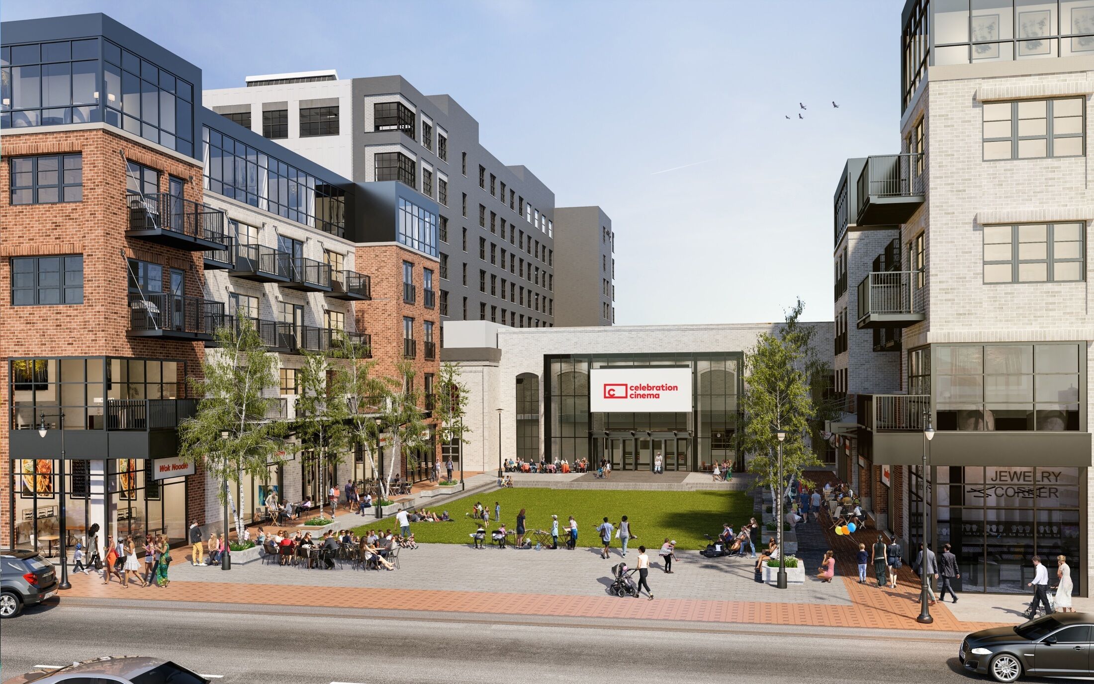
Creating a place
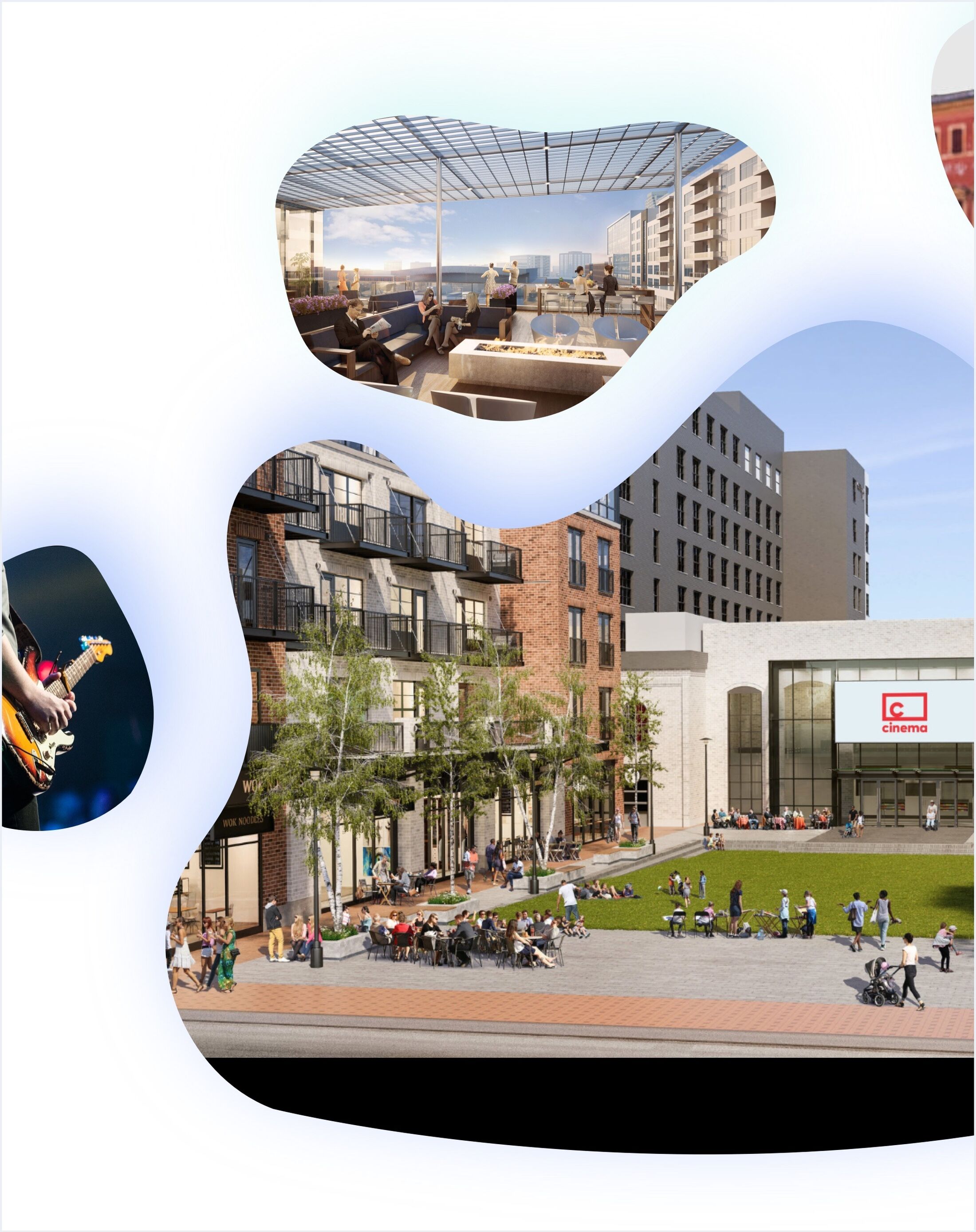
When complete in the Fall of 2019, Studio Park would occupy a full city block and consist of a public piazza surrounded by a Celebration Cinema, a Studio C-owned restaurant, a Studio C-owned concert venue, two Studio C-owned apartment buildings, a hotel, a parking structure, and other vendors/shops (mostly food and beverage-related). A Studio C-owned condo tower and a 90,000 sq. ft Class A office building were planned on the site as well.
Studio C wanted to position Studio Park as the new heart of downtown Grand Rapids—an entertainment destination that would orient and attract residents and visitors alike. At the time, they were focused on securing tenants and building awareness and enthusiasm for the coming attractions. Location, location, location was the biggest selling point. Which was a challenge: Studio Park didn't exist yet; the future site was little more than a fenced-off patch of bare earth dotted with heavy equipment. And the new Studio C brand was relatively unknown and still evolving.
Planning and information architecture
It was a bit like working on a puzzle, except we only had two pieces and a vague picture of what we wanted the finished puzzle to look like. Now we had to design the other pieces—and fit them all together.
Building on the strategy work we'd done while designing a new ecommerce experience for Celebration Cinema, we kicked off the project with stakeholder interviews to establish business goals and priorities for three connected business units: the apartments (and condos), the restaurant, and Studio Park as a whole. Through these conversations we identified our audiences and gathered whatever physical plans and documents existed. There wasn't much, but it was enough.
Over the course of about seven weeks, Mighty's Director of Strategy created a series of four interconnected strategy briefs. The first three focused on each individual business unit: we defined and mapped organizational and project goals, modeled the relationships between each digital and physical space, extended the user archetype model we'd established for Studio C's cinema website, mapped user journeys, conducted comparative research, defined content requirements and structures, and designed site maps. The fourth strategy brief tied all the others together. If that sounds like a lot of work, trust your instincts.
Visual design and direction
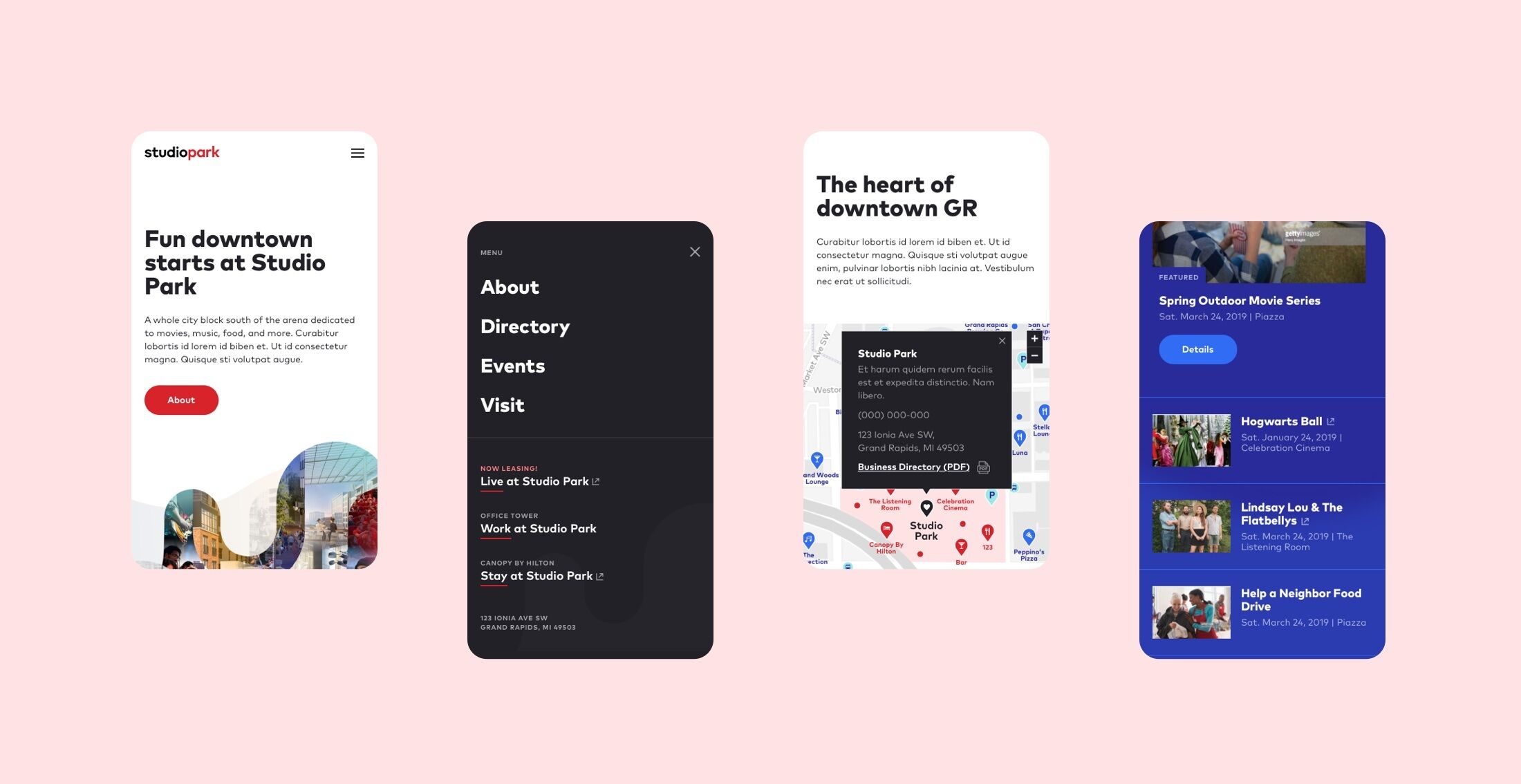
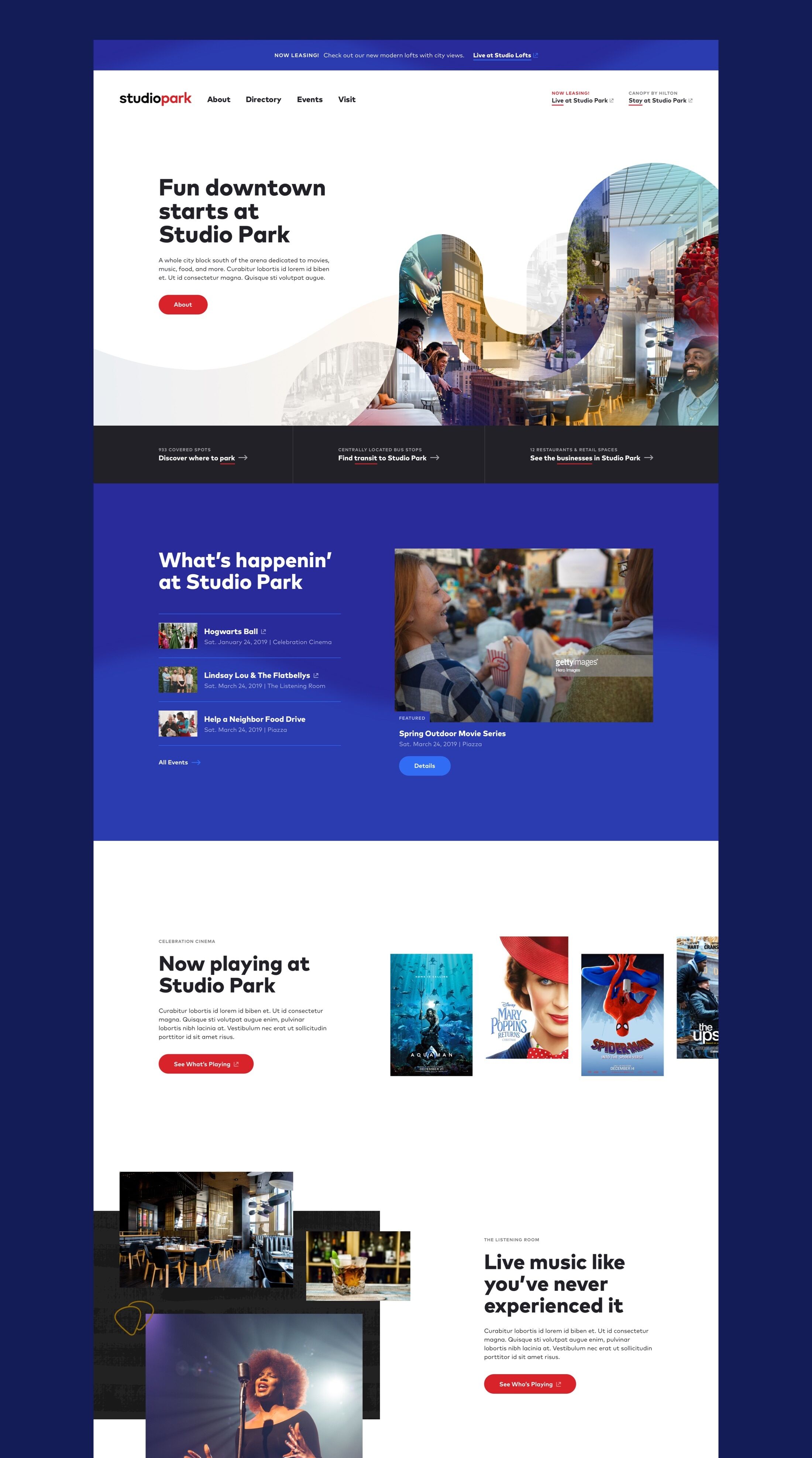
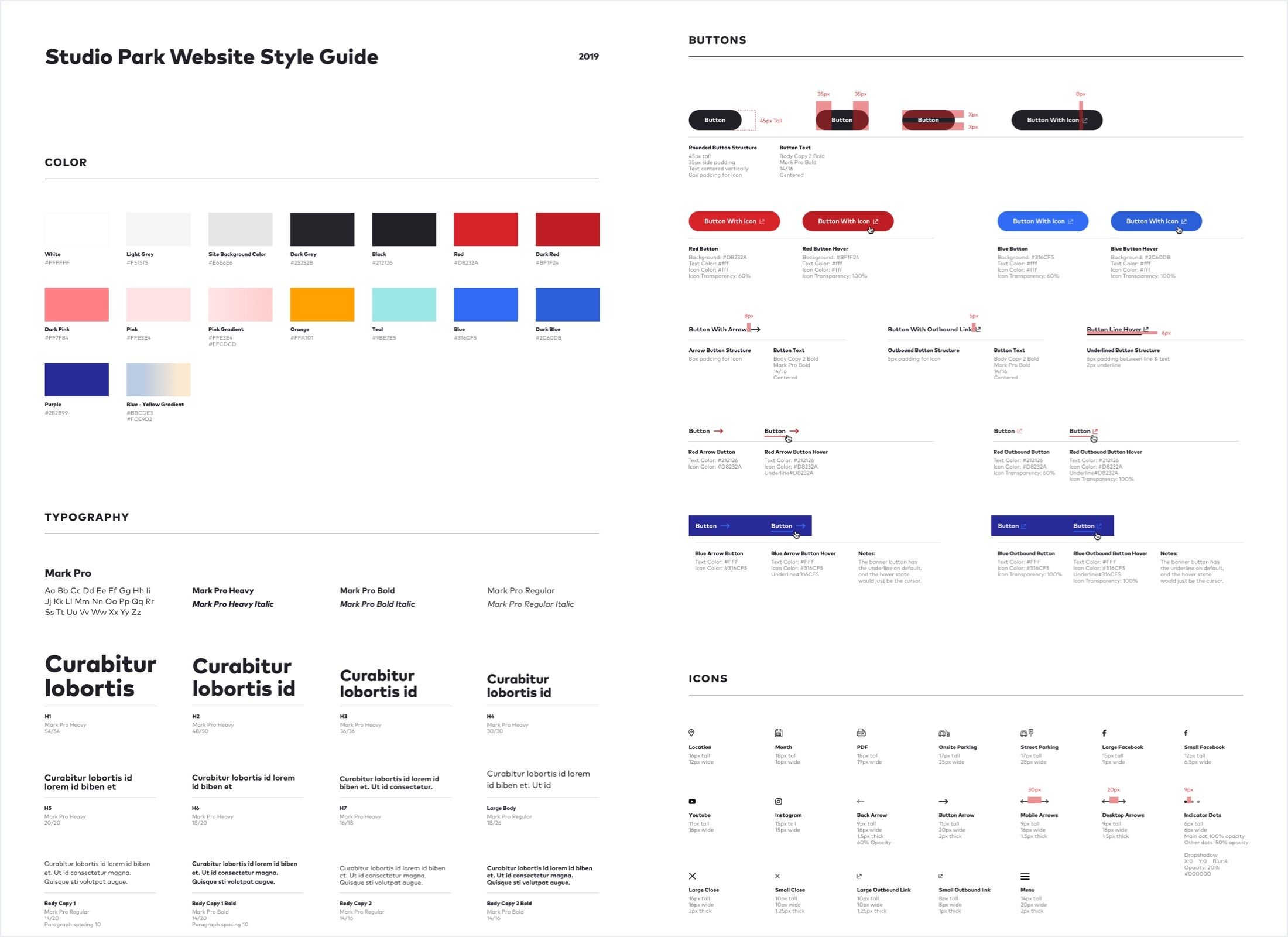
With our strategy brief as a guide, we took inspiration from Studio C's emerging brand and our work on Celebration Cinema to assemble a moodboard, flesh out wireframes, and create a design concept for the Studio Park website. Once our direction was approved, we extended the concept into complete desktop and mobile design mockups for handoff to another partner. We equipped them with a style guide and provided support and direction throughout development.
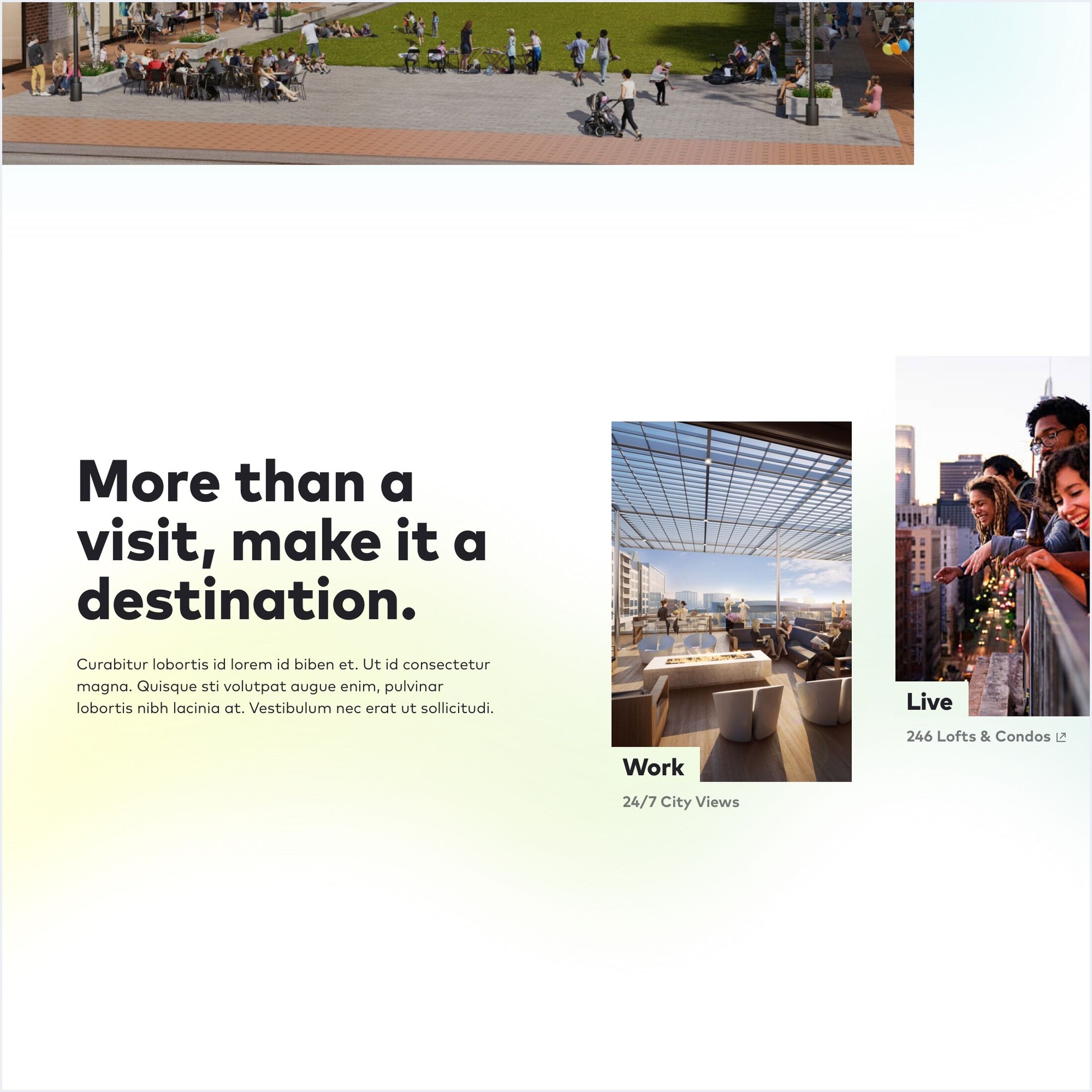
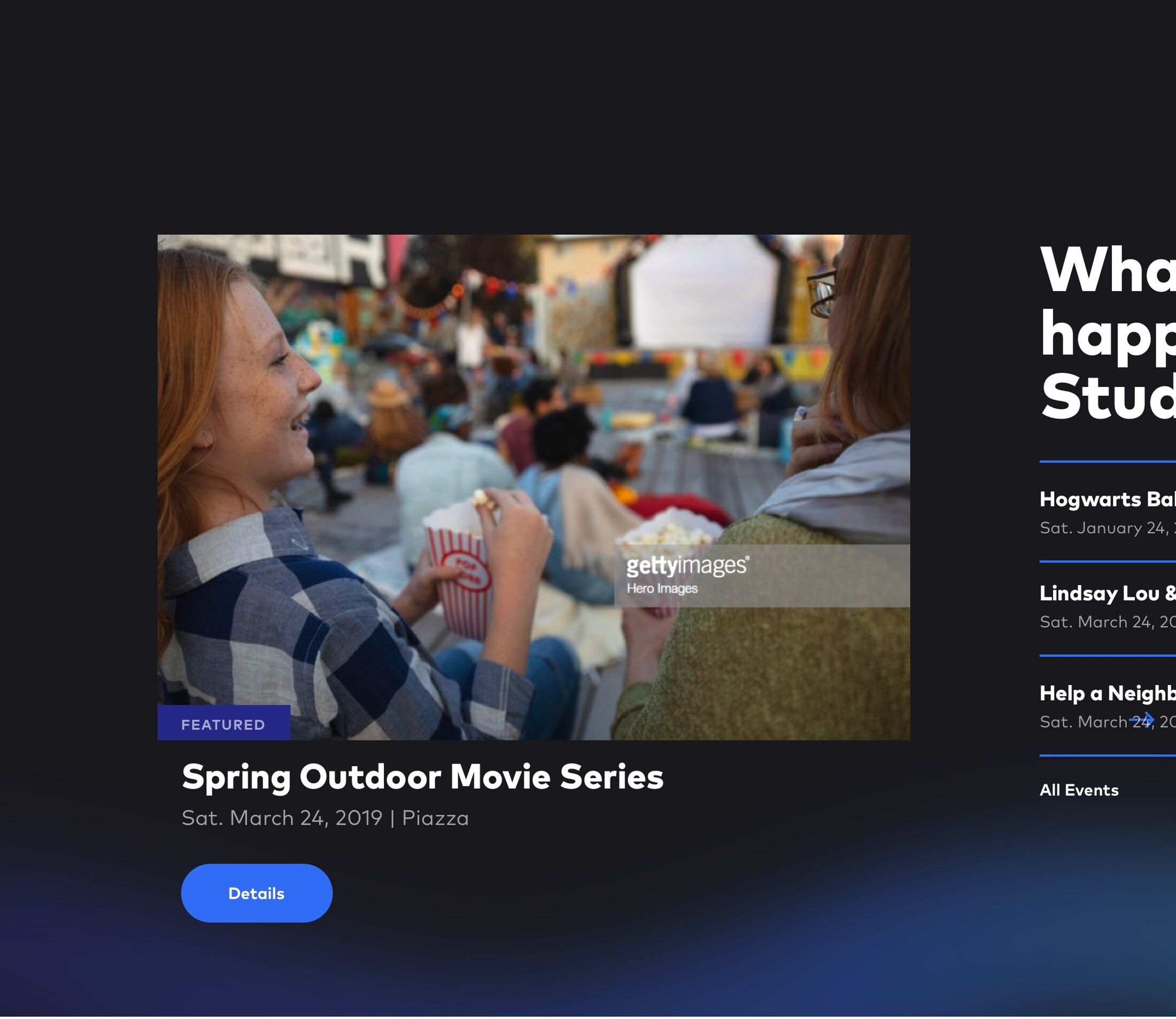
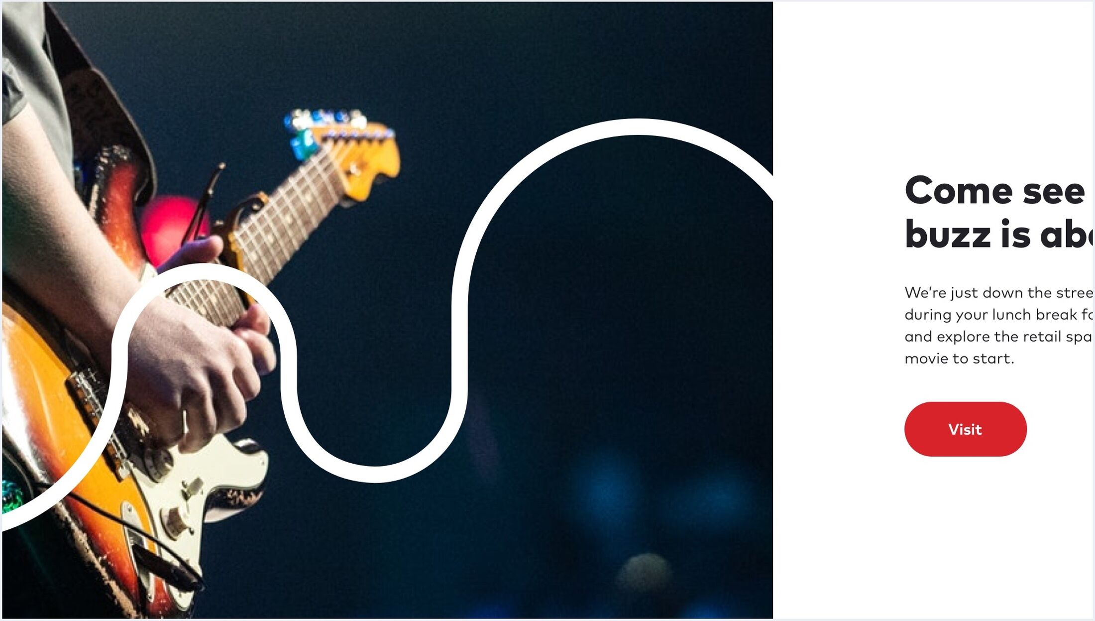
We also created the digital brand for Studio C's restaurant, which now had a name: One Twenty Three Tavern—but that's another story. Studio Park celebrated its grand opening on October 2, 2019.
Have an idea? A project?
Our favorite clients tend to treat us as part of their team (and vice versa). If you’re looking to make something digital and interesting, we’d love to help you bring your ideas to life.
Let's talk

