Information architecture and digital branding for multiple interconnected projects
Studio C was working on something extremely ambitious. Scratch that—they were working on about half a dozen extremely ambitious things at the same time, and each of them were at different stages of development. The Studio C brand—formerly known as Loeks Theatres, Inc.—was new, and the identity was a work in progress. And their business was changing. A lot.
Through this season of change, their team leaned on Mighty to help rearchitect and design their cinema ecommerce website, develop a digital strategy for a major downtown development project, lead digital branding for a restaurant and concert venue, and more.


Video Transcript
Ian Labardee, Mighty Principal Design Director (00:05):
The Studio C Project was an interesting project to tackle because a number of different websites is what they came to us for. But really what it turned into was an opportunity to help them with a much broader digital branding project. And so in general, the project was really about, hey, let's understand how our users interact with all these different websites, but then let's also refresh the brand and actually establish a lot of the digital branding for all these different properties.
Jonathan Williams, Studio C Senior Marketing Director (00:33):
We were dealing with a site that was not working for us, not intuitive, having a lot of problems with people getting lost online. And so it was really a couple challenges with rebuilding a large site and then how do we intuitively direct to five or six new websites with new products and how do we can connect everything in a way that kind of makes sense to the consumer?
Eric Kuiper, Studio C Chief Creative Officer (00:55):
We weren't really working on one project. We were working on like five of them all at the same time, and they were all in different stages of development. And so I think we were able to move into a place of high trust. And I think one of the driving factors for us, we really cared about the aesthetic of the site. We knew we needed to get that information architecture part right, because that was a major obstacle for our consumer, but we very much believed that the whole experience was important. This is a team that actually understands that the way it looks is kind of 1A to the 1 of having the actual information architecture done correctly.
Brett Carlson, Studio C Creative Director (01:37):
I think some of the things that we knew we could expect is attention to detail and design. We internally have a pretty strong design culture, and we really wanted to see that make its way to all of our different platforms, websites, branding, et cetera. And they were a valuable partner in helping us roll that out.
Kate Dunn, Mighty Designer (01:58):
One.Twenty.Three's visual design system is the design system I'm most proud of because we use a lot of illustrations and icons and that really helped shape One.Twenty.Three Tavern's brand. And so some of those elements are actually used on the menus and signage and social media. So it's really cool to see those designs in real life action.
Eric Kuiper, Studio C Chief Creative Officer (02:21):
Of course, no one really knows what a company is behind the curtain. You know, what the office is like and what the culture is like when you leave the room. My experience was always that coming into the space, that it was a positive creative generative space, that the team was engaged. And I think that culture goes a long way and can affect the projects that they're working on in a significant way.
Danni Shultz, Mighty Senior Account Manager (02:50):
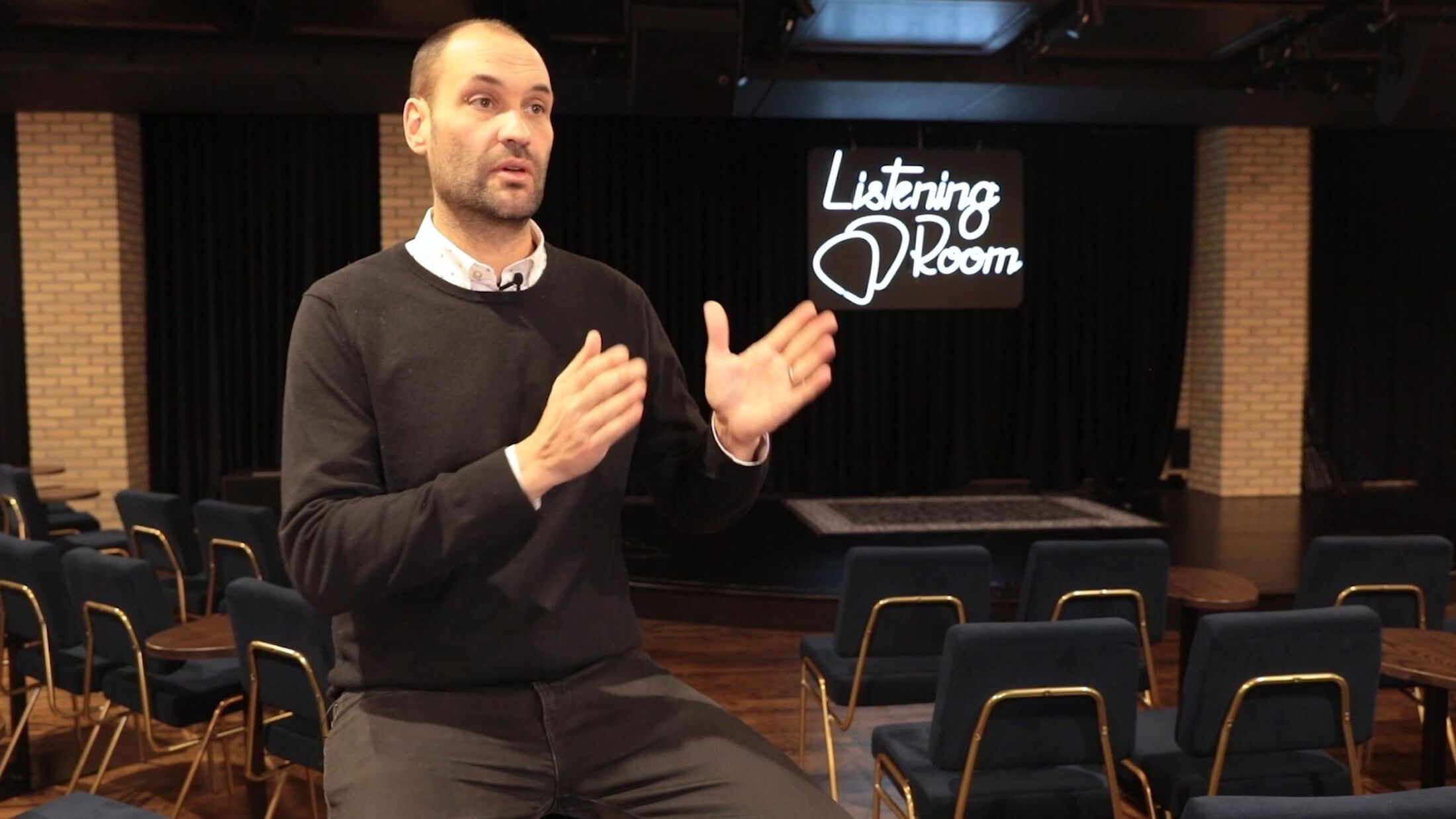
It was a really cool feeling to be a part of a project in the city of Grand Rapids that's kind of like the beating heart of this place now. It's right in the heart of downtown, really close to our office. It's neat to be able to see it right from our space, but everybody knows what this is. And it's really cool to bring more awareness to Studio Park. A lot of people knew about the theater coming downtown, but didn't know about a new music venue and a new restaurant. So to say that we played a small role in that and designing and bringing the physical space to reflect in their web presence was a really cool thing to be a part of.
Have an idea? A project?
Our favorite clients tend to treat us as part of their team (and vice versa). If you’re looking to make something digital and interesting, we’d love to help you bring your ideas to life.
Let's Talk

